The 7 Best World Cup Posters Of All Time
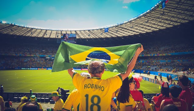
Photo by Caio Resende from Pexels
It’s that time again. The World Cup is here and football has taken over. So what better time to do a post about some football related design?
With each World Cup comes a different host nation, each of which brings their own unique culture to the table. Fashion, social trends, films, art, literature. The beauty of the World Cup is that it brings all the vastly different people of the world together in a celebration of sport and competition. And with each new tournament there’s a new theme, a new colour palette, a new brand.
In this post we’re going to focus on the posters from each of the 21 World Cup tournaments, and whittle the selection down to our all-time favourite 7. Enjoy!
7 — England, 1966
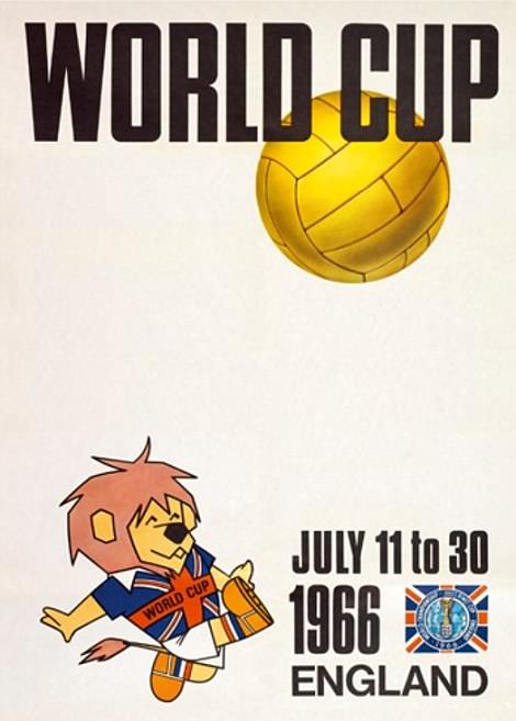
A biased entry, maybe, but England’s poster entry of 1966 was a commendable effort. It features a simple and playful style, and boasts the very first World Cup mascot in the form of World Cup Willie. In that regard, it’s one of the most innovative posters on the list!
6 — Brazil, 2014
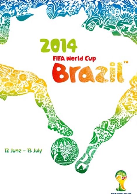
This clever design uses negative space to create the outline of the country itself. It sports a very colourful and exotic design, with a light, festive vibe about it. It’s vibrant, bright, and although the chosen font might not be the nicest in the world, the overall aesthetic and loose illustrative style encapsulates the theme very nicely.
5 – South Africa, 2010

This poster employs a clever use of imagery and colour. Using the shape of Africa to outline the footballer’s head, and the colours of the South African strip, it’s a patriotic poster and emits a strong sense of identity.
4 — Russia, 2018
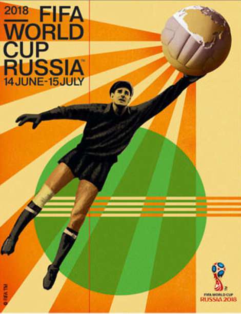
The most recent (current, in fact) addition to the World Cup poster archive is also our number 4. The style here is evocative of a much older time, comparable to some of the earlier World Cup graphics. It makes use of the artistic style from the Russian Constructivist period (from which many revolutionary posters were derived). It also features an image of one of the most enduring and beloved figures of Russian football — Lev Yashin.
3 — Korea/Japan, 2002
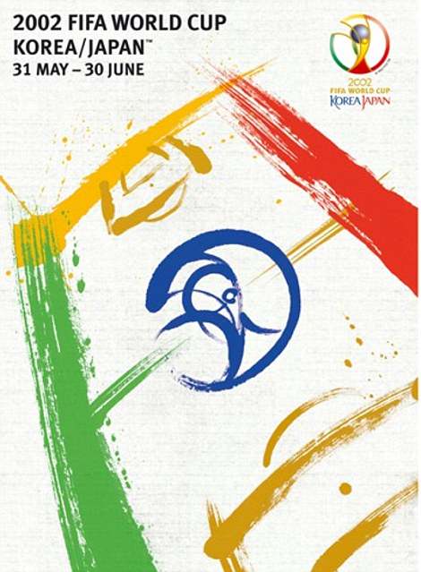
For the first and only co-hosted World Cup, the two host nations each assigned an artist to contribute to the competition’s primary poster. The use of calligraphy here to illustrate the pitch is a brilliant idea, and one that seamlessly blends the nature of the event with a classically Eastern visual style. There’s also a clever integration of the official logo (shown in the top right) into the pitch’s centre circle. This, again, unifies the global aspect of the competition with the nuances of the cultures in which it is taking place.
2 — Italy, 1934
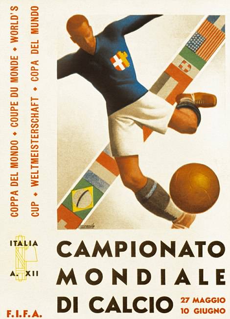
This poster was designed in the classic Art Deco style of the 1930s. Using a Futura font, its illustrations and overall aesthetic are very much of the period. It also marks the first of only four instances in which the flags of the other competing nations are displayed in the host’s poster.
1 — Mexico, 1970
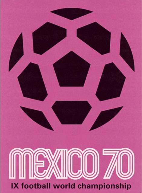
Coming in at the top of the list is Mexico’s 1970 entry. What really works here is the poster’s stark simplicity. It uses a classic 70s font, and opts for a very minimal, neutral design. The choice of pink for the leading colour may appear slightly confusing, but its beauty lies in the fact that, as far as international football is concerned, it doesn’t really represent anybody. Unlike many of the countries who hosted before them, Mexico steered away from displaying flags or any other kind of national identity. It seems, of all the posters, to be the most inclusive, and the one that focusses the most on the game itself.


