Design Fundamentals: Understanding Typography
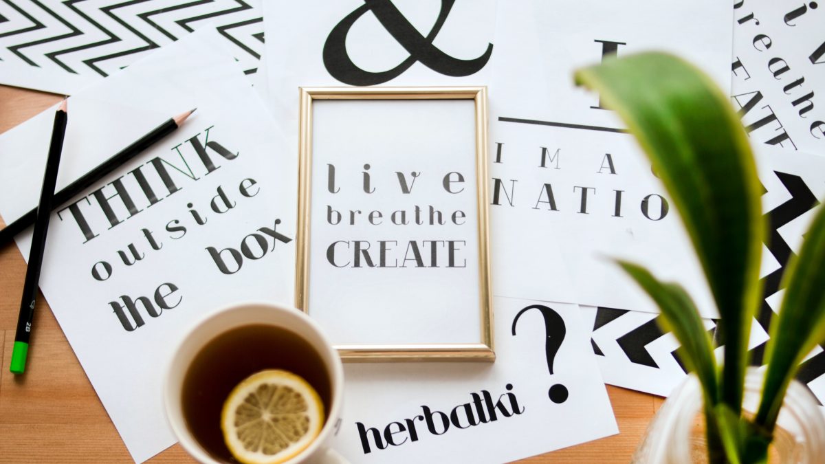
Photo by Dominika Roseclay from Pexels.
Typography is everywhere. In brochures, magazines, and blog posts. It’s one of the basic ingredients of good design.
In a subtle sort of way, typefaces and fonts show people what kind of brand you are, and what sort of business you run. They can be loud or quiet, soft or striking, colourful, subdued, sleek, blocky, round or square. They come in all shapes and sizes, and they’ll feature in nearly every piece of marketing you ever create. But despite all this, it’s easy to take the power of typography for granted.
So we’ve put together a quick guide to typography and how to use it. We hope you find it useful.
Definitions
Whenever you talk about typography, it’s good to start with a few definitions and differentiations.
First of all, typography. Merriam-Webster defines it in two ways:
- Letterpress printing.
- The style, arrangement, or appearance of typeset matter.
For modern day designers the second definition is probably more relatable. But whatever the case, we can look at typography as the overall art of making letters look good on a page.
Beyond that (and where it becomes a little confusing) we have fonts and typefaces. Most of the time these words are used interchangeably, but by definition they’re quite different.
A typeface is a set of characters that share common design features. Helvetica is a typeface. So is Futura, Courier, Times New Roman, etc.
A font, on the other hand, is a a certain weight, style, size, and effect of a typeface. So, as we’ve mentioned, Helvetica is a typeface. But Helvetica Bold, Light, and Oblique are all fonts within thetypeface family of Helvetica.
Why is typography important?
Typography is a key component in brand recognition and design accessibility. Getting the typography right means creating aesthetic balance and establishing proper visual hierarchy.
Typography is a brand’s “visual voice”. It represents how a business wants to be perceived, and is responsible for the way in which that business communicates with its users.
In a nutshell, typography helps to guide readers through a piece of marketing. It’s what makes copy readable, accessible, and effective.
Basic typefaces
There are some typefaces that are so diverse they can be used for just about anything. We could call these the “basic” typefaces, and they include Helvetica, Franklin Gothic, Frutiger, Garamond, Bembo, League, and Shelley. And part of what makes them so ubiquitous is the fact that they each have such a large font family.
With all of the above-mentioned typefaces, there’s a huge choice when it comes to presenting the weight of the font. Bold, heavy, light, and super-light make typefaces like Helvetica incredibly flexible. In other words, they’ll work perfectly in a variety of contexts.
Themed typefaces
When you’re designing to a specific theme, it can often be beneficial to use hyper-specific, novel typefaces. For example, if you’re aiming for a retro or futuristic aesthetic, there are typefaces you can use to evoke those particular themes.
This needs to be approached with caution, however, and it’s a good idea to err on the side of subtlety. The problem with themes is that they often go hand-in-hand with clichés, and it’s easy to overdo it. So it’s important to make sure that the typefaces you use are unique enough to not feel old and overused.
In this way we can think of themed typefaces as the opposite of the basic ones. The general advice being, if you’ve seen it around a lot, avoid it. After all, the whole point of using special typefaces is to make your marketing stand out.
Knowing what works, when it works, and why
At a core level, there’s a certain aesthetic that people expect from particular industries and sectors. There’s a reason, for example, why many formal businesses such as law firms present themselves through serif fonts.
Every typeface and font has its own particular uses, and developing a feel for what works best where and when will be extremely helpful.
Just remember that your fonts should represent your business for what it is. There’s a lot of creative space, but this should be the core principal to work from.
Design Fundamentals
For more design fundamentals, take a look at our previous post on how the human eye reads a page.


