
Winter Design: Tips For Evoking Cosiness And Warmth
Photo by Hannah Gibbs from Pexels
Winter is a great time for businesses to infuse a bit of warmth into their marketing mix. All it really takes is a few subtle shifts in colouring and imagery, and you can bring all the comfort and cosiness of a fireplace to your next campaign.
Why go warm?
Warm colours remind us of heat. And, in the dead of winter, heat makes us feel safe and comfortable. So, warm colours are analogous with comfort and cosiness.
This is good news. It means that we can piggyback on the positive emotional effects of these colours simply by using them.
The idea here is that by just adding some reds and oranges to a leaflet it becomes more inviting. It will appear warmer, and as a result will evoke those warm feelings in the reader.
Who can benefit?
Admittedly, the warm spectrum is particularly suited to hospitality-based businesses. It’s easy to see why cafe’s, B&Bs, and hotels can all benefit from portraying their establishments as warm and inviting. But this shouldn’t deter the rest of us.
Even locksmiths can take advantage of warm-colour marketing. For example, a locksmith could send out leaflets showing an image of a frozen door, with snow all over the footpath, and through the window we can see a warm-looking room, lit by the glow of a fireplace and some candles. So, even though the living room isn’t the main focus of the leaflet, its presence will indirectly communicate warmth, comfort, and affability.
This method can be employed by any business for a quick winter-warmer effect.
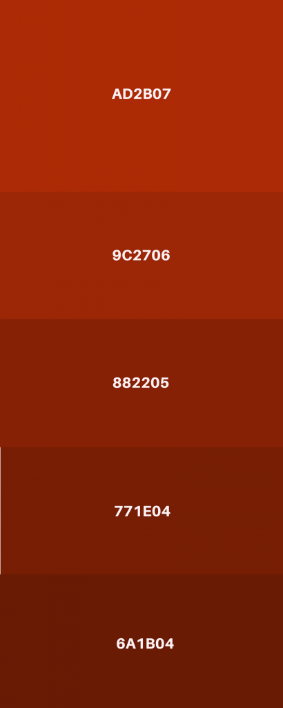
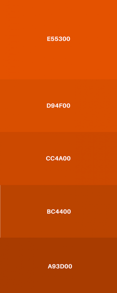
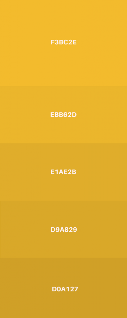
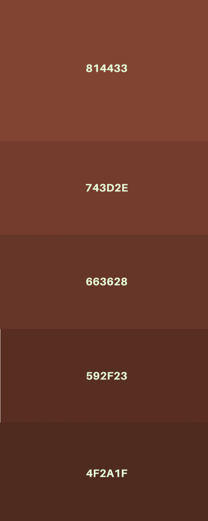
What are the cosy colours?
To get an idea of which colours fall under the ‘warm’ blanket, take a look at the palettes below. Note: the web codes are provided for each colour. To use any of them, simply type the corresponding code into the colour selector of whatever image/icon/background you’re editing.
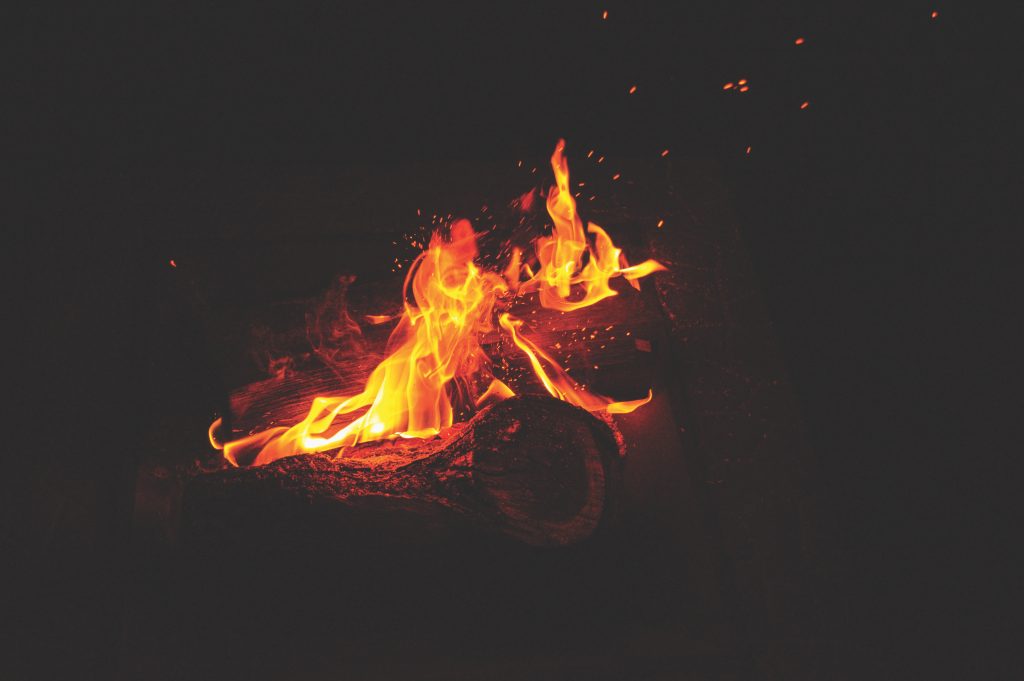
Ambient lighting
An essential element of creating cosiness and warmth in a physical space is the proper use of ambient lighting. Fairy lights, table lamps, tea lights, and candles all contribute to that particular “hyyge” feeling that makes a room warm and inviting.
Luckily we can use the same method to sprinkle some winter warmth into our designs. Think back to the example of the locksmith’s advert. All it really takes to emulate the feeling of being in a cosy room is, simply enough, an image of a cosy room.
And by combining this kind of imagery with a warming colour palette, we’re already most of the way there.
Foliage
One of the most universally-adored times of year is the transition from summer to winter. There’s something unavoidably comforting about the colourful transformation undergone by trees and plants as they respond to the turning of the seasons. (This is undoubtedly why the colour palettes designers like to use in winter are identical to the autumnal palettes of nature’s foliage.)
Again, the method here is to simply take the thing that itself generates feelings of warmth and comfort, and superimpose it onto our designs. It almost feels like cheating, but sometimes there’s just no need to reinvent the wheel.
Words of warning
The caveat however (and this applies to incorporating imagery of both foliage and ambient lighting) is that it needs to be done tastefully. Because the biggest problem with using these universal comfort-generating symbols is that everybody uses them.
And it’s very easy to overdo it. Think of an oversaturated, collage-like poster featuring a slew of winter images all layered one on top of the other. So the key is definitely restraint. Just one or two images, and one or two colours, should be more than enough to evoke the desired response.
Keep it colourful
If you’d like to learn more about colours and how to get the most out of them, take a look at our post on the art of using colour in design.

