The Psychology of Colours And Shapes: What Reds, Yellows, Squares, And Circles Say About Your Brand
Colours and shapes: the subtle tools. The non-verbal masters of communication. As a business, the colours and shapes you feature in your designs will tell a very specific story. Not only about your values and how you perceive yourself, but slow about how you wish to be perceived by others. That’s why colours and shapes make such integral design elements.
So to kick off our deep-dive into this subject, let’s start with the basics of colour coding for businesses.
Colour and sector
It’s important to be aware of the colour palettes native to particular sectors. This way we can learn the rules before breaking them. Because unless you know which part of the spectrum is generally used to represent your industry, you won’t be able to apply the psychology of colour to your own business in a meaningful and unique way.
Some typical colour/business pairings:
-
- Finance and law: generally a traditional, authoritative aesthetic. This usually manifests as dark blue, burgundy, and classic green. Very little/no use of primary colours.
- Environmental: lots of greens and blues (representative of grass and sky).
- Youth oriented: this can be seen as the reverse of finance and law. Generous use of primary colours like red, yellow, and blue. Fewer dark, moodier colours (like burgundy).
- Minimalist: black and white are standards of minimalistic design.
These are, of course, only representative of general trends. And whilst it’s common to see darker, more traditional colours used for the branding of a law firm, there will be examples of companies who go against the grain.
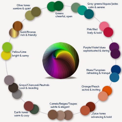
The main thing to focus on is mood. Think about the feelings you want your brand to evoke.
To help in pairing your own business to a specific mood, take a look at the chart below. As an experiment, look at your branding as it is now. Then think about how you want your brand to be perceived (lively, friendly, elegant, etc). Does your current colour palette align with your desired mood? If not, look at what mood it does represent, and ask yourself if that could be potentially detrimental.
Defining your spectrum
First of all, try to stick with a maximum of two colours when creating a spectrum for your logo. This is generally a good rule to follow. But when it comes to your overall branding and marketing, there’s room for the palette to expand. For example, if your logo is black and orange, then you can expand to incorporate other colours like blue and green when putting together marketing materials (this could mean using a blue background on a flyer, or a green border on a business card). The key is to make sure that any additional colours compliment the colours of your logo.
There’s always a lot to think about with regards to colour in business. And it’s certainly beneficial to give it some deeper consideration when it comes to branding, re-branding, and marketing. And once you know the rules, it can really help to consolidate the tone and personality of your overall brand.
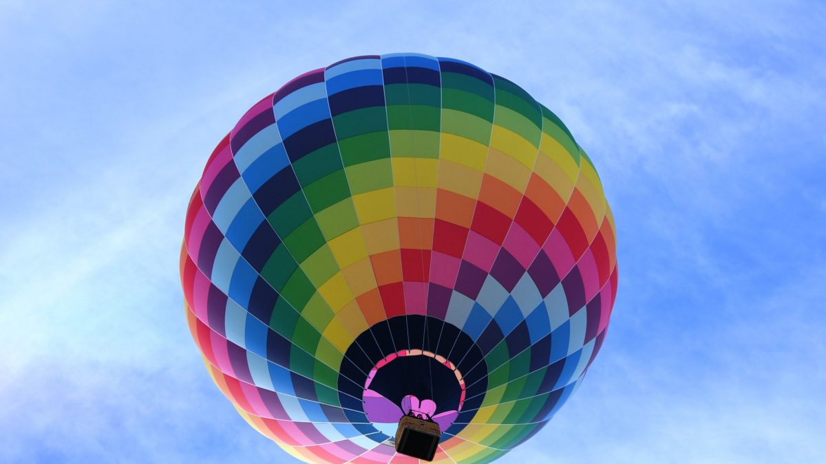
Using warm colours
Warm colours, though used more frequently in winter, are perennial winners when it comes to aesthetically-pleasing design. That’s because warm colours evoke feelings of comfort, safety, and coziness.
Warm colours generate particularly strong emotional connections, which means that we can piggyback on the positive emotional effects of these colours simply by using them.
The idea here is that by just adding some reds and oranges onto a leaflet we’re making it more inviting. It will appear warmer, and as a result will evoke warm feelings.
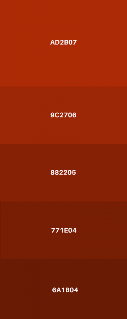
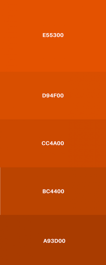
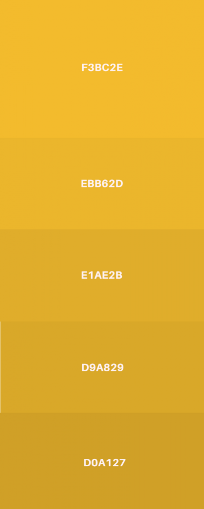
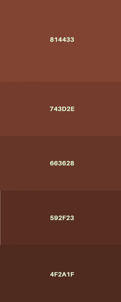
The warm spectrum
To get an idea of which colours fall under the ‘warm’ blanket, take a look at the palettes below. Note: the web codes are provided for each colour. To use any of them, simply type the corresponding code into the colour selector of whatever image/icon/background you’re editing.
The psychology of shapes
So we’ve talked about colours, but what about shapes (the things we put the colours in)? Shapes are everywhere. From coffee cups to smartphone screens to the moon, our eyes are confronted by shapes all day, every day. And with each shape comes a wealth of symbolism, meaning, and association.
In business, the shape of a logo says a lot about the brand it represents. So to make sure we’re saying the right thing, we must first learn to speak the language of shapes.
So let’s explore some of the basic shapes and what they communicate to us.
Circles
Partnership, stability, endurance, community, friendship, unity, protection. Circles naturally communicate positivity. And their likeness to rings is symbolic of marriage, which implies endurance and fortitude.
This is a good shape for eliciting trust, and showing your customer that they are safe in your hands.
Circles are also very easy on the eyes due to their smoothness and lack of angles, which some perceive to be evocative of happiness and youth.
This shape also lends itself perfectly to brands trying to position themselves as natural, humble, and environmentally-conscious, as the circle is a shape synonymous with nature. After all, we don’t say “the square of life”. From fruits and flowers to moons and stars, the circle is ubiquitous in the natural world. So when we’re trying to evoke mother nature in our designs, we would do well to employ a circle or two.
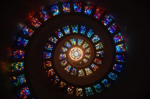
Spirals
Speaking of natural shapes, there’s nothing that encapsulates life and all its mysterious manifestations quite as successfully as the spiral.
Spirals are seemingly complex, yet incredibly elegant and symmetrical. You can find them in the smallest seashells and the largest galaxies.
Spirals can be used to evoke to awe, intrigue, mystery, and elegance. They’re also interesting from a mathematical perspective, and can be used well-balanced visuals via the famous “Golden Ratio” (also known as Fibonacci’s ratio). It’s maybe a bit too much to get into here, but if you’d like to learn more about the golden ratio take a look at this feature by National Geographic.
Needless to say, the spiral is a grand shape, and though it’s far from universal in its design applications, if used properly it can create mesmerising and memorable results.
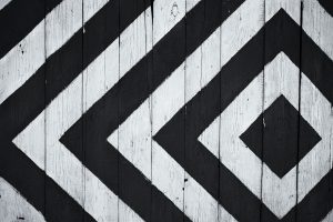
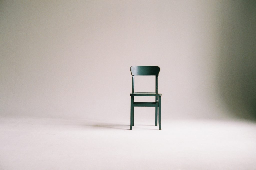
Squares
Reliability, strength, power, and balance. You can’t knock a square over. There’s a certain precision and efficiency inherent in this shape. And it’s a solid workhorse. Great for businesses that rely on being perceived as strong and dependable.
Squares are excellent for creating orderly and aesthetically-pleasing patterns. They can also be used for framing scenes or specific elements of a design. This is great for calling attention to objects or items with an image, or to simply create a sense of order and linearity in an otherwise hectic visual.
Always bear in mind that although the square is a strong shape, it is sometimes associated with rigidity, inflexibility, and stubbornness. So if you’re opting for a free-spirited and spontaneous feel in your designs, use squares with caution and care.
Triangles
Energy, science, religion, law, strength, purpose. Many powerful organisations and institutions incorporate triangles into their branding. So this is a shape with very authoritative connotations.
Also synonymous with success and hierarchy, humans often perceive the triangle as a representation of the journey from zero to hero. Even terms like “reaching your peak” or “peak performance” evokes images of triangles, and allude to success waiting at the tip.
Triangles can also be used to subtly manoeuvre the viewer’s eye to a certain point, or to simply allude to a certain direction.

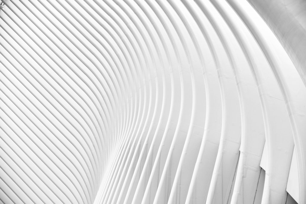
Curves
Tenderness, support, comfort, compassion. The curve cares. Often utilised in the form of a smile, the curve is a gentle symbol for a softer approach. Great for companies that want to build strong and meaningful relationships with their customers.
Curves evoke feelings a calmness and relaxation, and are perfectly suited to embodying grace, elegance, and the concept of flow.
It’s of interest to also note that curves are often associated with sensuality (particularly when embodied in human form), but with regards to design and branding, it’s unlikely that a curve will be construed as “sexy” (depending, of course, on how you use it). Rather it’s more likely that your brand’s curves will be perceived as modern, sleek, and stylish.
Thoughts on shape
When thinking about the psychology of shapes, it’s important to remember that we don’t consciously register their associated emotions. When we see a circle, we aren’t suddenly flooded with images of unity and friendship. So it’s not essential that we take their meanings literally.
That said, these associations exist for a reason. And being aware of their underlying psychological symbolism can help businesses alter how their brand is projected and perceived.
