Design Fundamentals: The Art Of Creating Business Cards
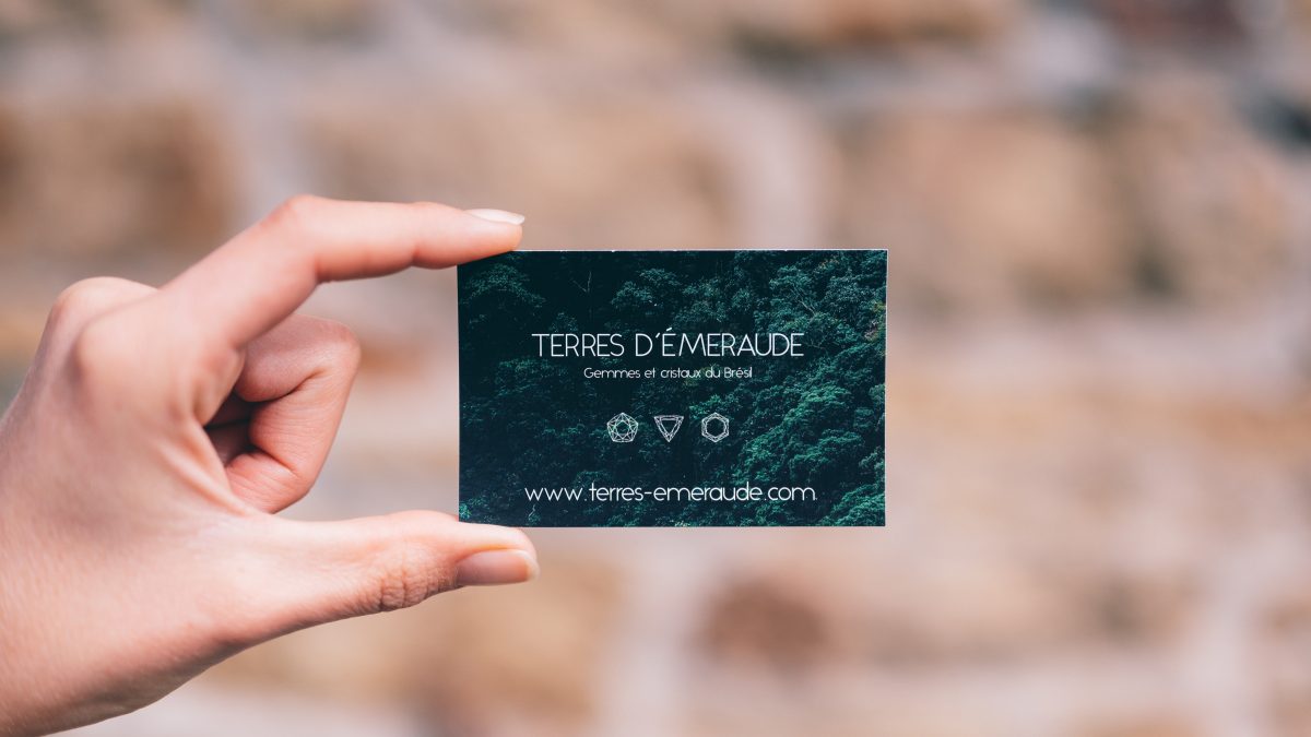
Photo by Conscious Design on Unsplash.
We live in an ever-expanding digital world, there’s no question about that. And one side effect of this is the contracting of the physical world. This might sound a bit dramatic, but when it comes to businesses and how they operate it’s often true.
Nowadays a huge amount of business is conducted online, from e-commerce to Zoom meetings. But despite this reality, there are still a few components of any good business that remain physical and essential. One of these is, of course, the business card.
The humble business card is of perennial importance, and will always come in handy. And it can even be made digital, which makes it even more indispensable.
With that said, it makes sense to put some real effort and thought into the creation of a business card so that it can be of the highest possible quality. And we’re here to help with some dos and don’ts of making great business cards.
Stick to the one-size-fits-all formula
Creating a business card that conforms to standard sizing (85 x 55) is more important than you might think. Often it can be tempting to think outside the box with your design in order to make it stand out. You might, for example, decide that you want your cards to be miniature, or triangular, or star-shape. And whilst this works if it fits in with your brand. Most of the time it just presents an inconvenience, as oddly-shaped cards are harder to slot into card holders.
So although it is good to break the rules where possible, the size and shape of your business cards is something that is usually best kept within the norm.
Know what you want to say
The major restraint of a business card is space. And often the problem comes down to this: you have a lot to say but not a lot of room to say it.
So you must consider your core message, and how you can communicate it not only with words but with design too. In fact, design is arguably much more important than text in a business card.
Because ultimately, when you’re working with such limited dimensions, the visuals, colours, and overall aesthetic will do most of the communication.
The best approach here is to really know your brand identity inside and out. Then you can decide what key words and visual elements can be used to capture and express that identity in the most minimalistic way. This leads right on to the next point…
Use your space wisely
The conundrum, once again: too much information clutters your card, whilst not enough doesn’t get the relevant information across. The trick here is to include only the essential details. For example, most people don’t need to put a physical address on their business card. In the majority of cases, and email address, contact number, name, and website will suffice.
The same goes for photographs. In the name of space-saving, you can afford to cut the mugshot unless your face is an important element of your brand identity (if you’re a model or an actor, for example).
Choose your type carefully
In design, typography is always important. But in fewer places is it more important than on a business card. Because of the card’s small size, the typography used will often play a huge role in the overall look and feel of the finished article.
The key elements to consider are: size, font, and colour. These form the building blocks of your business card’s typographical aesthetic, and should always be chosen carefully.
Again, it can be really beneficial here to have a firm grasp of your brand identity. That way you can develop a better sense of the sort of fonts and typographical styles that will represent you most accurately.
Lay it out
Once all the individual elements are settled, the last step is to lay them out. Again, a good aim here is to be as simplistic as possible.
Consider the flow of information, and possibly even formulate a hierarchy based on the importance of each individual component. For example, if you prefer receiving emails over telephone calls, you could consider making your email address the most visible and eye-catching of all your contact details.
The key to a good layout is to make everything flow smoothly, whilst establishing a clear hierarchy within the content.
Leave some white space if you can
If you’ve read our blog before, you might already know that we love white space. And business cards and white space go together perfectly.
It may seem counter-intuitive at first. After all, business cards are already tight on room, so why waste perfectly functional space on nothing? But the more white space you use, the more attention you draw to the primary contents of your card.
And considering that a business card is, ultimately, a tool of utility, it’s important that it should be as easy to navigate and uncomplicated as possible. By employing white space, then, you can easily eliminate distractions and place emphasis on the more important elements of your design.
Look at samples
Lastly, if you decide to create your own business cards, always make sure to get samples from printers before committing to any particular thickness or finish. Nothing compares to holding a physical product in your hand to judge whether or not it feels right. The same goes for choosing between an uncoated or glossy finish. Unless you can see it in front of you, you’ll never really know how the end product will come out. So inundate yourself with samples. Try everything. That way your business cards will be of the highest quality possible, looking pristine and sharp.
Design fundamentals
For more design fundamentals, why not take a look at our previous posts on understanding typography and the graphic designer’s toolbox.


