
The Ultimate Guide To White/Negative Space: What It Is And How To Use It
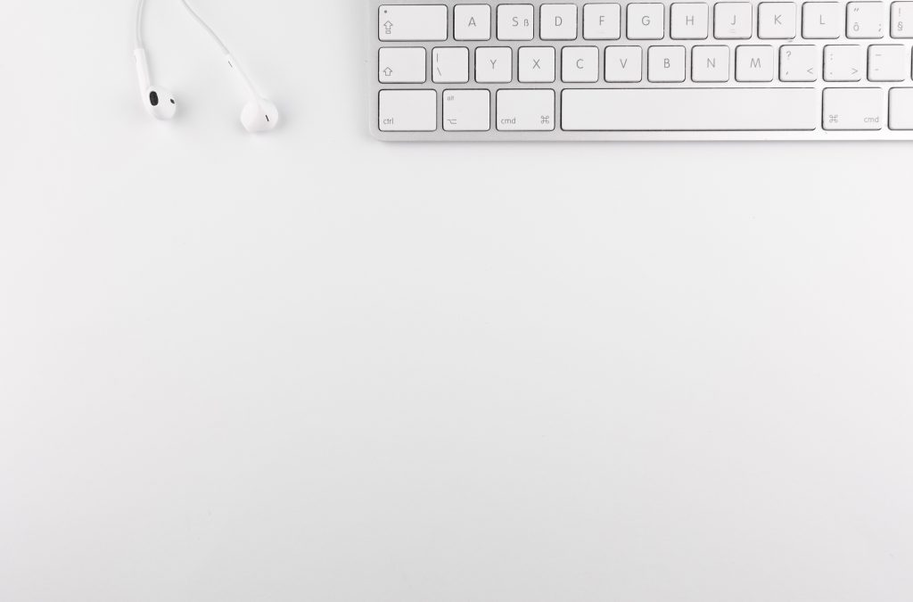
White space is the area of a page in which no text or imagery appears. Also known as negative space, it’s essentially the empty bits between the content.
But it’s also a part of the content. And it shouldn’t be overlooked as accidental or coincidental. Most of the time, the white space you see on web pages or advertisements is very much deliberate. But why might a designer want to add in ‘nothing’? What are the benefits of white space and why is it so important?
Types of white space
First of all it’s good to know the different kinds of white space that can be incorporated into your designs. Generally, of course, it could all be classified as the same thing, but on a more detailed level white space can be categorised into macro, micro, passive and active.
Macro white space constitutes the areas between the largest elements of a design. Things like graphics and text columns. This is the most striking and immediately-obvious to the eye.
Micro white space, on the contrary, makes up the smaller spaces between words, lines, icons etc. Not as noticeable, but it still has an impact on the overall aesthetic and feeling of space.
Passive white space refers to the subtlest gaps and spaces – the ones that go mostly unnoticed. This can be intentional or unintentional, and general includes everything that would otherwise fall under the “micro” category.
Active white space, on the other hand, is employed specifically to draw the user’s attention. This is the most deliberate and purposeful and “artistic” type of white space.
So, with the types out of the way, now we come to the principles of intentional white space, the first of which is…
Balance
In general, the cleaner the design, the more balanced it will be. The more balanced it is, the easier it is to digest. This is one of the most important reasons to employ white space: it makes things easier to understand. With clever use of white space, the reader is able to comfortably absorb what’s in front of them without being overpowered by busy layouts and lots of images.
Focus
When utilising white space, unnecessary details are automatically stripped away. This means that the focal point of your design, be it an image or piece of text, will naturally shift into focus. With no extraneous details to clog the page or divert the eye, the heart of the message will stand out organically. And separate parts of the page won’t be in competition for your reader’s attention.
Perception
One of the great advantages of white space is its ability to steer and influence users’ perceptions. If you want to create a luxurious, premium, modern, or simplistic aesthetic, white space can do a lot of the work for you.
This is because white space naturally emphasises the content it encompasses. Which means that it can also help to convey a sense of importance, exclusivity, and quality. Imagine a poster advertising a bottle of beer. If the poster was entirely white and contained only the image of the beer bottle and the logo, it would communicate an inherent sense of significance and class. In this case, the courage of the design to rely on nothing but the product itself would be enough to endear it to the viewer.
Legibility
A common white space sin is to ghost a large image into the background of a page and layer the text on top. This can be the cause of some major legibility issues. Imagine, for example, an image of a redbrick house under a cloudy sky. Imagine that this image takes up one side of A4, and written over the top are a few paragraphs of advertising copy in white font. The colour contrast between the text and the house won’t be too bad, but what about the clouds? White-on-white will likely be problematic. The best solution for this particular problem would be to avoid using the image in the first place.
Applying this simple rule – to remove large and busy images – can have a surprisingly powerful impact on the overall aesthetic and appeal of a design.
Less is more
The old adage is as true as ever. Less really is more. And replacing large blocks of text or unnecessary images with white space is the perfect way to simplify a page. It’s not something to be afraid of. By incorporating white space in a thoughtful and somewhat strategic manner, you can drastically enhance the impact of your design whilst reducing the actual amount of content it delivers.
Even by simply increasing the size of your margins, you can give the impression of less without taking anything away. It’s easier to read a line of text when it contains fewer words, so by widening margins you’re fabricating white space whilst also increasing readability.
How to design with white space
Leave lots of empty space
This may seem like a no-brainer, but it’s the first (and most important) rule of designing with white space.
The space doesn’t have to actually be white, but the idea is to approach the design with space in mind. If creating something open and minimalistic is your goal, then the canvas itself becomes part of the design, and leaving empty spaces will be a natural part of the process.
Bring down the borders
Borders can bring a surprising amount of constriction to our designs. And simply taking them away can lend an enormous sense of space and openness to any aesthetic.
This is one of the easiest ways to bring white space into a design, so it’s always worth trying!
Use letter spacing
Expand or condense the spacing between letters to help create space.
Expansive letter spacing helps create a sense of openness and distance. Whilst condensed spacing allows more space for the surrounding design.
Focus on one design element
By focussing on a single element, such as a word or icon, we can easily reduce the peripheral clutter in a design.
If you take a relatively simple visual element and emphasise it, by either enlarging it or taking away surrounding content, it focusses the viewer’s eye on a single point. This focussed perspective, when complimented by a minimalistic peripheral landscape, can really open up a design.
More design tips
For more on effective design techniques, why not take a look at our guide to creating an effective leaflet, or learn about utilising the psychology behind colours and shapes to enhance your marketing.
